I remember standing in the middle of my first tiny studio apartment, clutching three different paint swatches and feeling like a complete failure because none of them looked like the “dreamy sage” from the Pinterest board. I spent four hours staring at a corner of the room, convinced that if I didn’t figure out how to choose a color scheme that looked professionally curated, my entire life would feel cluttered and chaotic. But here’s the truth I had to learn the hard way: those perfectly staged, monochromatic living rooms aren’t living spaces; they’re museum exhibits. You don’t need a degree in design or a massive budget to create a room that feels right; you just need to stop trying to mimic a magazine cover and start looking at how you actually live.
In this post, I’m skipping the expensive design jargon and the “rules” that make your head spin. Instead, I’m sharing a practical, low-stress framework for picking colors that actually work with your existing furniture and your real-world mood. We aren’t aiming for perfection here; we are building a functional palette that makes your home feel like a sanctuary, not a showroom.
Table of Contents
Ditch the Trends for Real Color Theory for Interior Design

Look, I get it. You scroll through Pinterest, see a stunning sage green living room, and think, “That’s it. That is my new personality.” But trends are fickle, and what looks great in a staged photo often feels exhausting in a room where you actually live. Instead of chasing whatever shade is currently viral on TikTok, I’ve learned to lean on the actual color theory for interior design. It’s not about being an artist; it’s about understanding how colors interact so you don’t end up with a space that feels chaotic or, worse, totally lifeless.
The secret to creating a cohesive room aesthetic without the headache is understanding the relationship between tones. You don’t need a degree to master complementary color combinations—you just need to know if you want high-energy contrast or a low-key, calming vibe. I always suggest deciding on your temperature first: are you leaning toward cozy, sun-drenched warmth or a crisp, breezy coolness? Once you pick a direction, the rest of the decisions start to make sense, and you won’t feel like you’re constantly fighting against your own walls.
Warm vs Cool Color Palettes Finding Your Daily Energy
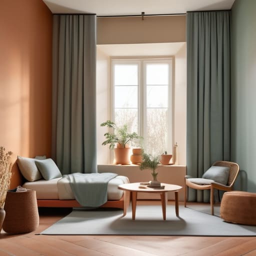
When you’re staring at a wall of paint swatches, it’s easy to get lost in the “vibes.” But instead of asking if a shade is pretty, ask yourself how you want to feel when you’re actually living in that room. This is where the psychology of color in home decor becomes your best friend. Warm palettes—think terracotta, soft ochre, or creamy beiges—tend to feel cozy and social. They’re great for a living room where you want to host friends or a kitchen where you actually want to hang out. On the flip side, cool tones like sage greens, dusty blues, or soft greys are your go-to for spaces where you need to decompress, like a bedroom or a home office.
The trick isn’t choosing one or the other and sticking to it like a drill sergeant; it’s about balance. If a room feels too “clinical” or cold, you don’t need to repaint the whole thing. You can just introduce warm textures—a wooden side table or a mustard throw pillow—to bridge the gap. Finding the right balance between warm vs cool color palettes is less about following a strict rulebook and more about making sure your space matches your daily energy.
Five Ways to Pick a Palette Without Losing Your Mind

- Stop trying to match your walls to a Pinterest board. Instead, look at the things you actually own and love—that worn-in leather chair, a specific rug, or even your favorite ceramic mug. Use those existing pieces as your anchor colors so you aren’t starting from scratch every time you want to change a room.
- Embrace the 60-30-10 rule to keep things from feeling chaotic. Aim for 60% of a dominant color (usually your walls or large rugs), 30% of a secondary color (upholstery or curtains), and 10% for an accent color (pillows or art). It’s a simple way to create balance without needing a degree in design.
- Test your colors in your actual lighting, not just under the bright LEDs of a showroom. Grab a few sample swatches and tape them to your walls. Check them at 10:00 AM, 4:00 PM, and under your lamps at night. A color that looks like a soothing sage in the morning might turn into a murky swamp once the sun goes down.
- Don’t be afraid of “ugly” neutrals. You don’t need a perfectly curated monochromatic white sanctuary to have a nice home. Sometimes a muddy grey or a warm beige is much more forgiving when life happens—like when you inevitably spill coffee or track in dirt.
- Leave room for evolution. Your color scheme shouldn’t be a life sentence. If you pick a palette and realize three months later that it makes you feel restless, don’t panic. It’s much easier to swap out a few throw pillows or a piece of art than it is to repaint an entire apartment.
Forget the Pinterest Perfection
Stop trying to build a room that looks like a professional studio shot and start picking colors that actually make you feel at home when you’re exhausted at 7:00 PM on a Tuesday.
Audrey Lin-McCallum
Stop Overthinking and Start Living
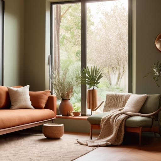
At the end of the day, choosing a color scheme isn’t about following a strict rulebook or matching every single piece of furniture you own. It’s about understanding how light hits your walls and whether you need a space that feels like a high-energy workshop or a quiet sanctuary to decompress. We’ve talked about moving past fleeting trends, balancing those warm and cool undertones, and prioritizing functionality over a curated aesthetic. Remember, your home is a living, breathing part of your routine. If a color makes you feel grounded and helps you navigate your daily chaos a little more smoothly, then you’ve made the right choice, regardless of what a design magazine might say.
Don’t let the fear of making a “mistake” keep you stuck in a loop of endless scrolling and indecision. If you pick a shade and realize it’s not quite hitting the mark, you can always change it—a new rug, a different throw pillow, or a fresh coat of paint can fix almost anything. Life is messy and schedules are tight, so give yourself permission to build a space that works for you in real-time. You don’t need a showroom-perfect house; you just need a home that feels like a reliable partner in your everyday life. Now, grab that notebook, pick a direction, and just start.
Frequently Asked Questions
What do I do if I already have a piece of furniture or a rug that I love but it doesn't fit the new color scheme I'm planning?
First off, breathe. You don’t have to toss a piece you love just because it doesn’t match a Pinterest board. That’s how you end up with a house that looks like a showroom but feels like a stranger’s. Instead, use that “mismatch” as your anchor. If it’s a rug, pull a secondary color from its pattern to use for your pillows or throws. If it’s furniture, maybe a quick coat of paint or new hardware bridges the gap. Work with what you have; it’s what makes a space feel lived-in.
How much of a room should actually be the "main" color versus using accent colors so it doesn't feel overwhelming?
Think of it like a recipe: you need a base, not just a pile of spices. I usually aim for the 60-30-10 rule to keep things from feeling chaotic. Aim for 60% a dominant neutral or calming shade (walls/rugs), 30% a secondary color (upholstery/curtains), and 10% for those punchy accents (pillows/art). This gives your eyes a place to rest so the room feels intentional, not overwhelming.
Is it worth it to buy expensive paint samples, or is there a way to test these colors without turning my living room into a giant swatch book?
Look, I get it. Buying a dozen tiny sample cans feels like a slow descent into madness, and honestly, it’s a waste of money if you don’t use them right. Skip the expensive “tester” pots for a second and grab a few peel-and-stick samples if your budget allows—they’re a lifesaver. If not, just grab one small can of your top two contenders. Paint large swatches on actual poster board, not the wall, so you can move them around to see how the light hits them throughout the day.